There’s an art to effectively guiding your readers around your site, so that they know how much content is available, and where to find things when they want them. The easiest way to make a site easy to navigate is simply to not surprise the reader: put things where you would expect them to be positioned. This tutorial will review the best practices that have resulted from years of practice.(Ross,2010)
According to(Helen McCormick,2009),navigation contains two aspects: Search classification and interactive viewing. I am going to use her theory to analyze how Levi’s works in this area.
Search classification:
Website navigation-Ease of use, Too simplistic, Direct route, Different search options
Merchandise classification-Detailed categorise, Utilitarian categorise. hedonic categorise
Interactive viewing:
Viewing function/purpose, viewing rules/responsibility, none purchase opinion
(Helen McCormick,2009)
Search classification
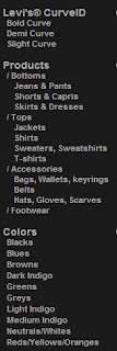
There are several “navigation cues” used on Levi’s UK
But as for the categorise, It is detailed and utilitarian. Customers could look for products by specific item as bottom or top, T-shirts or jackets, blacks or blues Customers could gain Efficiency and achievement from the functional navigation design, as well as an hedonic shopping experience.
Interactive viewing:
Viewing apparel products in a variety of ways can help customers visualize how the items might look when worn(Ha et al.,2007)
Customers gain product details and products information through pictures, video , magazines.
Online retailer depend on image interactivity functions producing photo-realistic rendered images,3D images that rotate, and close-up images, these images enrich the information available to customers and help them estimate the visual and tactile qualities of the product(Inter Corp.,1999,cited in Fiore and Jin,2003)
On the Levi’s website. they use different ways to provide all the information about the product. Photo images, videos, music, ads are fully used in Levi’s media center and news&events to explain the product, to enlarge the brand image and to spread the sprite of Levi’s. It is a fantastic way of the online interactive viewing.
But there is some limited aspects in the web design.
This is a picture that Levi’s show the jean. They only have the front and back view of their product.3D image is not used to “create and manipulate visual images”. Customers could not even know how will it looks like on person. No hedonic sense they gained, no purchase decision they made.
To sum up, these little tips are all my personal opinion and I think all the retailers have their advantages and disadvantages.I am learning and gaining a lot from them.


R2W6A(%60XIYLAQC~WA.jpg)


